Liquidkillsu
Leona
Posts : 15
Reputation : 0
Join date : 2013-11-18
 |  Subject: Hello Everyone Mon Nov 18, 2013 10:32 pm Subject: Hello Everyone Mon Nov 18, 2013 10:32 pm | |
| I saw you guys were affiliated with Xenon academy and its kinda dying over there, I am hoping this academy is more active with its members. To keep me busy most of the time, I can't wait to meet all of the new people here. Heres some background information on me, my name is Mitchell and I am 20 years old I have played yugioh since it first came out but stopped playing when XYZ. I recently started playing about 3 days ago and I am trying just to get a little better then what I use to be and basically caught up on everything I missed. |
|
Amaterasu
Moderator
Posts : 4394
Reputation : 13
Join date : 2013-08-31
Location : Hokage Mansion
Character Sheet
Name:
HP:
    (100/100) (100/100)
Age:
| | Subject: Re: Hello Everyone Mon Nov 18, 2013 10:34 pm | |
| Hey, welcome to ODA. If you need anything or have any questions, feel free to ask me or any other member of staff. Enjoy your stay here. |
|
Liquidkillsu
Leona
Posts : 15
Reputation : 0
Join date : 2013-11-18
| | Subject: Re: Hello Everyone Mon Nov 18, 2013 10:38 pm | |
| Actually I just message an admin (Acidik) about how you guys should make another rank that all new members go into instead of going straight into slifer, that way everyone gets tested and properly placed. Also as you can see the slifer rank isnt working |
|
rakhalix
Leona
Posts : 371
Reputation : 4
Join date : 2013-06-19
Age : 26
Location : Indonesia
Character Sheet
Name: Rakha
HP:
(100/100)
Age: 15
| | Subject: Re: Hello Everyone Tue Nov 19, 2013 1:16 pm | |
| Like untested Group?, i think it's a little weird in the GX series in duel academy the students start in Slifer so yeah it's a little weird for me if there's an Untested Group, btw Welcome to ODA! |
|
Fluff Fluff
Zed
Posts : 4045
Reputation : 9
Join date : 2013-10-07
Age : 30
Location : Mist Valley
Character Sheet
Name: Fluff
HP:
(0/0)
Age: 20
| | Subject: Re: Hello Everyone Tue Nov 19, 2013 1:49 pm | |
| Welcome to ODA. We'll be happy to teach ya here. |
|
Liquidkillsu
Leona
Posts : 15
Reputation : 0
Join date : 2013-11-18
| | Subject: Re: Hello Everyone Tue Nov 19, 2013 6:01 pm | |
| @rakhalix actually they were all untested students because Sebastian was new and he got into RA, its why they had the entrance exams.
@Fluff Fluff can't wait thanks! |
|
Taisakuno Shouri
Zed
Posts : 515
Reputation : 33
Join date : 2013-02-24
Age : 27
| | Subject: Re: Hello Everyone Tue Nov 19, 2013 7:58 pm | |
| ODA was an all test everyone joining an academy until mid summer. This idea was implemented, mainly because ODA has a lack of strong professors, or teachers who could maintain the the standards that I and maybe a couple of admins pretty much set forth. With the lack of strong testers, we lack the abilitty to keep handling floods of new members and putting them in a more accurate dorm, instead of sub-par results, and some professors just being ran over and yelled at for making bad results. Even now, in my opinion the professors don't really sound professional and know what they are doing. I'm definetely seeing it in Twiddget's Test Results, although Sasukat is new I won't judge him for now... Also I felt Raven's test report was pretty bad. The main idea here, is that testing members joining an academy will ALWAYS be the better of the 2 system for every ygo forum. It promotes activity, competition, and increases the chances of members staying by a good amount of percentage as there are most posts to boom from. As an academy, you want to aim for as much strong staff, especially in the teaching area to maintain this idea. Here is a spoiler of what ODA "used" to be like. - Spoiler:
Orichalcos Duel Academy
Graphics and Layout
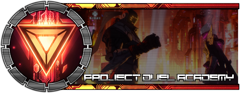
Banner (Score: 8/10)
The banner is above average, good but not exceptional. The background image with the 3 monsters is good, but the text font is arguably unoriginal. The font looks very standard and uninspiring, looking like something you'll find in a lame Word document or Powerpoint. Try something exotic and new, a design that shows off creativity and introduces something unique to your members.
Navigation Bar (Score: 5/5)
The navigation bar is good, very clean-looking and matches your forum background well. The subtle shading on the button backgrounds is superb and adds an important sense of depth. I also like the font used for these buttons . Your "new PM" button is questionable though, as the continuous flashing verges on being annoying. I'd try for a calmer flash, at the most 2 flashes per second. Any more than that and you're going to give an epileptic a seizure. A suggestion I have for you is maybe look into rounding the corners of the "Forum" and "Login/Logout" buttons as this may enhance the sleek appearance, though this comes down more to personal preference.
Post & Forum Icons (Score: 2/5)
I'm not really feeling the post and forum icons. I think it's the color of the buttons which is too blue sticks out like a sore thumb. More importantly, it doesn't relate to your forum theme nor do they fit in with the rest of the buttons around the forum. I would go for a dark themed button color here, perhaps a nice dark blue, gray, or light black. Kudos to you if you can also incorporate Yu-Gi-Oh themes into the buttons - this will really help develop a sense of "theme." The rest of the forum icons are fairly decent though, they fit in with the theme appropriately.
Background (Score: 1/5)
Unfortunately, I'm going to dock points here for the solid back background. There are so many things and options you could do with a background that truly affects and changes the entire "feel" of a forum. The background plays a critical role in establishing the mood of the board.
My personal recommendation would be a cool landscape background, such as this or maybe this. I'm just quickly listing images I find off of Google, but I hope you get the idea and go in this direction
Alternatively, even if you like the black background, you could still add some creative touches to it. Perhaps add some subtle patterns or textures into the black. Have fun with the background! Your members will too.
Other Forum Images (Score: 3/5)
The "Who is Online" image is good. I can't really remember what the image inside of it represents, but if I remember correctly, it had something to do with summoning (long time since I played this game ). Nice touch here.
However, the staff ranks rather stick out and don't really fit in with the forum theme. I'd highly recommend finding new ones. Yu-Gi-Oh themed ranks would be best, and dark blue, black, or gray colors would be optimal.
Theme (Score: 6/10)
Scrolling down the forum threads, I feel there are way too many seas of black. I feel like you could really work with improving the theme. The points I've mentioned previously will greatly help with this.
Forum/Category Layout & Organization (Score: 6/10)
Your forum/category layout is good! I like how the majority of forum sections all had new content posted the same day. This is very important: every forum section should have new content daily. However, I think the forum index organization can be improved. For one, you are using 3 columns, with the forum index in the middle. This gives a cluttered and disorganized feel. I highly recommend using only 2 columns, one column in the middle for the forum and one on the side for widgets. Do not add 2 widget columns, this is highly unsightly and takes away from the user's forum experience.
Also, I'm feeling that the chatbox should be moved to the bottom of the forum index. As of now, the chatbox is just a big ugly blob of blackness that sits at the top of your board that makes it annoying for anyone scrolling down the main page. In fact, from a personal members' perspective, I automatically assume any site with a chatbox at the top as "noob" and often leave after a short browse, never to return again. Yup, it's that bad. If you take anything from this review, please remember this.
Finally, I'm looking at the Portal, and to be put it bluntly, it's horrible. Again, I'd recommend reducing the widget columns down to 2, as this adds more of a modern look. The profile widget sits at the top of the entire portal, looking hideously out of place. I don't know what the heck the navigation widget is doing right below it as you already have a NavBar. And to make things worse, I see the same widget again on the right-side widget column. As for the rest of the portal, there's just way too much text and clutter. And you're pretty much just repeating the same information from the forum index page, there's nothing new. Thus, I highly suggest you simply remove the Portal page altogether. You obviously already have the forum index as the homepage, so a Portal page that reiterates info serves no purpose whatsoever.
Despite these two small setbacks, don't fear, they can be quickly resolved. The rest of your board's organization is commendable
Score: 31/50
Special Features & Originality
Widgets (Score: 3.5/5)
I feel that you have room for adding some more widgets! Widgets are an important factor in enhancing a site's theme and content. Widgets can also drastically change the feel of a board. Adding more pictures will definitely enhance a forum's image. Just thinking off the top of my head, maybe add more to your "Card of the Week" widget by including spell cards, trap cards, and monster cards. Maybe you could also add tips of the month. The purpose of widgets is to add convenience and interesting content, so keep that in mind.
Notable/Unique Design & Coding Features (Score: 3/10)
Besides the chatbox, I see little else. Lame! phpBB2 gives you the option to manipulate templates so put that to good use! Go and seek some tutorials; you'll be able to add new features to your board that will bring delight to your users. More importantly, it sets your forum apart from competing boards and allows you to dominate the competition, allowing your board to expand and grow.
Design & Coding Extras (Score: 0/5)
Really, I did not see anything here. Thus I won't go into depth. Work on the previous things I've mentioned earlier in this review. Once you've gotten those things down (which are more important), start focusing on design extras.
Score: 6.5/20
Generalities & Activity
Member activity (Score: 8/10)
You have a good amount of daily users online and active at one time. However, with 293 members at the time of this writing, the 11942 post count is rather paltry.
Staff activity (Score: 10/10)
Good. I see most staff have been active within the past few days. Nothing much to say here; passed with flying colors.
Usergroups (Score: 5/5)
Good amount of usergroups. Rather leaning on too many, but I see quite a few are related Clans and such so I will leave that part out of the review.
Score: 23/25
Note: I didn't give you a total score on this because I've noticed that the current maximum amount of points earn-able right now do not add up to 100. I've given you a letter grade instead.
ODA at that time was ranked a B class forum. That should be the goal of the staff currently, and they have to get there in order to implement small things as testing when you join.
Last edited by Taisakuno Shouri on Tue Nov 19, 2013 8:05 pm; edited 3 times in total |
|
Liquidkillsu
Leona
Posts : 15
Reputation : 0
Join date : 2013-11-18
| | Subject: Re: Hello Everyone Tue Nov 19, 2013 8:00 pm | |
| Sounds like you have your head on straight and are making good decisions. |
|
Sponsored content
| | Subject: Re: Hello Everyone | |
| |
|